
Sentence Formatting with Audience Appeal
A few years ago, I went from a position where I was writing primarily for an audience of women 30-50 years old to writing for an audience of women over 60. The biggest change for me wasn’t the offer – a business opportunity vs. a charitable giving opportunity – but the formatting.
The new company I was working with had tested various formats for their client and the target audience responded far better to an old-fashioned look and feel. It required a large typewriter-style font and double spaces between sentences.
Yes, I said it: Double. Spaces.
It made me nuts. Double spaces between sentences comes from the days of manual typewriters, which provided equal spacing for each letter typed. Two spaces after each sentence made the type more legible.
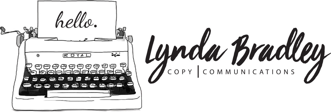
 I’ll admit, I’m old enough to remember typing classes in high school and the double spaces that were required, but those typewriters and double spaces went the way of the Walkman long ago. (Although I do love the look of old typewriters in décor and graphic design — see my logo!)
Today, most of us use computers with proportionate fonts, so there isn’t rogue white space within words, making a single post-sentence space more than sufficient for legibility. The double space, some say, actually decreases legibility. Nearly every major style guide calls for single spaces.
However, my client’s audience gave larger charitable donations when their fundraising letters came with double spaces. So double spaces it was.
When it comes to effective communications, you have to play the game of your audience’s choice and play by their rules. Testing various formats when you can will help ensure that your communications have the greatest appeal to your target audience and garner the greatest results.
Even if double spaces is the winner.
